All posts by Michael Carr

This Chart Shows Why the Stock Market Isn’t Overvalued

Many analysts claim fundamental ratios show that stocks are overpriced.

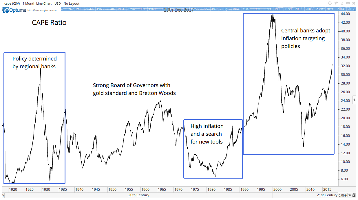
One popular long-term ratio is Dr. Robert Shiller’s cyclically adjusted price-to-earnings ratio, or CAPE ratio. With a recent reading of more than 32, the CAPE is higher than it was before the 2008 market crash.

Other ratios are also above their 2008 peaks. But these ratios don’t tell us very much by themselves. They need context.

One important factor is interest rates.

Over time, the Federal Reserve used different theories to set interest rates. The chart below shows those theories matter to the CAPE ratio.

The CAPE ratio is one of the ways to measure what stocks are worth. An analysis of it reveals why the stock market isn't currently overvalued.

Now the Fed includes the Federal Open Market Committee (FOMC), the Board of Governors and regional banks.

Regional banks controlled policy for about 20 years after the Fed’s founding in 1913. That structure failed in the Great Depression.

Since no one knew who was really in charge, stock prices were volatile. The chart shows wide swings in the CAPE ratio were normal at that time.

As the country emerged from the Great Depression, the Banking Act of 1935 established the FOMC. That group maintains significant control over monetary policy.

This was also a time when countries adhered to the gold standard. Policies under the Bretton Woods Agreement maintained relatively stable foreign exchange rates.

Each of those factors contributed, in part, to fairly stable CAPE ratios.

But stability was short-lived. International events moved rapidly in the 1960s. As the U.S. abandoned the gold standard, inflation rose, and policy makers searched for new tools.

By the early 1990s, central banks around the world started targeting inflation. Now they use monetary policy to nudge inflation toward 2%.

We don’t know if inflation targeting is ultimately the best policy. But the chart shows that policy led to higher CAPE ratios.

This makes sense. Inflation is now an official goal of governments around the world.

Moderate inflation generally leads to higher prices for stocks. That means stocks should be worth more.

The CAPE ratio is one of the ways to measure what stocks are worth. So, CAPE should be higher when inflation is near 2%.

The chart shows that the right level of CAPE changes as Fed policy changes. So, we should ignore long-term historical comparisons.

CAPE has averaged 26 under the inflation-targeting regime. At 32, its current level, CAPE is at the upper limit of its expected range.

However, that will change.

Central banks are not hitting their target of 2% inflation. They will probably shoot through that target, and we will have a higher-than-desired inflation soon. That could lead to new policy tools, and that would reset the fair value of CAPE.

When that happens, we will adapt to the new market environment. Until that happens, we should remain invested in stocks and enjoy the bull market.

Regards,

Michael Carr, CMT
Editor, Peak Velocity Trader

In this exciting NEW VIDEO, Wall Street legend and former multibillion hedge fund manager Paul Mampilly pulls back the curtain on the biggest investment opportunity in the market today. What insiders are calling “The Greatest Innovation in History,” this revolution will mint more millionaires and billions than any technology that came before it. Right now, the current market for this technology is just $235 billion, but given how fast this technology is moving experts predict it will soar to $19 trillion by 2020. But 8,000% growth is just the beginning—and now’s your chance to get in on the action. [CONTINUE TO VIDEO]

Source: Banyan Hill

Like All Bubbles, This One Will End Badly

Stock market crashes always seem to come out of nowhere. But, in hindsight, we realize that all the elements for a crash were in place months before prices fell. There will, of course, be another crash, and we can already see many of the black swans lining up to cause the crash.

A black swan is a rare event that no one seems to be able to predict. It could be a housing crash after prices soar to unsustainable levels and are propped up by lax mortgage-underwriting standards. Or a black swan could be a surge in inflation or a geopolitical crisis.

When we study the black swans after the fact, they seem obvious. There were clues, but investors ignored the clues because they were caught up in “irrational exuberance.” Sometimes, investors can remain irrational for years. That’s what happened in 1996, the last time Alan Greenspan issued a warning.

Greenspan was chairman of the Federal Reserve at the time. He famously asked: “How do we know when irrational exuberance has unduly escalated asset values, which then become subject to unexpected and prolonged contractions as they have in Japan over the past decade?”

Analysts at the time thought Greenspan was warning of a stock market bubble. He was, but the bubble lasted until early 2000, and the S&P 500 more than doubled before the bubble popped. Internet stocks recorded even bigger gains.

This time, Greenspan thinks we’re in a different kind of bubble…

 The Bond-Market Bubble Will Burst

For now, Greenspan thinks the stock market is in good shape. But he believes higher interest rates will cause a bear market someday.

Greenspan recently spoke to Bloomberg and confirmed what almost everyone who isn’t in the Fed believes: “By any measure, real long-term interest rates are much too low.”

In his view, the bond-market is in a bubble. And like all bubbles, the bond-market bubble will end badly.

“The real problem,” he said, “is that when the bond-market bubble collapses, long-term interest rates will rise. We are moving into a different phase of the economy — to a stagflation not seen since the 1970s. That is not good for asset prices.”

Many of us are too young to remember what the stock market was like in the 1970s. The chart below shows Greenspan was right. It was not a good time for asset prices, and investors suffered large losses.

Greenspan thinks the stock market is in good shape but that bonds are in a bubble. And like all bubbles, the bond market bubble is going to end badly.

The early 1970s was a time of relatively low inflation. The annual change in the Consumer Price Index is the red line in the chart below. The blue line shows the interest rate on 10-year Treasury notes.

Inflation jumped suddenly in 1973, and the Fed was slow to react. It kept interest rates too low for too long, and inflation roared toward 15%.

Greenspan thinks the stock market is in good shape but that bonds are in a bubble. And like all bubbles, the bond-market bubble is going to end badly.

(Source: Federal Reserve)

Eventually, the Fed raised interest rates and broke the inflationary spiral. But consumers endured high unemployment and high inflation while the Fed learned to battle inflation.

Maybe this time is different, and the Fed won’t allow inflation to accelerate. But that seems unlikely. We already have half of the stagflation formula in place with a stagnant economy.

Greenspan is warning that an unexpected spark will set off inflation. He’s probably right, because the Fed is in uncharted territory and has created a bubble in bonds. The bubble will burst … we just don’t know when. We do know, as Greenspan notes, that that will not be good for asset prices.

Regards,

Michael Carr, CMT
Editor, Peak Velocity Trader

In this exciting NEW VIDEO, Wall Street legend and former multibillion hedge fund manager Paul Mampilly pulls back the curtain on the biggest investment opportunity in the market today. What insiders are calling “The Greatest Innovation in History,” this revolution will mint more millionaires and billions than any technology that came before it. Right now, the current market for this technology is just $235 billion, but given how fast this technology is moving experts predict it will soar to $19 trillion by 2020. But 8,000% growth is just the beginning—and now’s your chance to get in on the action. [CONTINUE TO VIDEO]

Source: Banyan Hill 

How to Invest Your Money in 2018

You’ve heard it a thousand times: Past performance is not a guarantee of future performance.

Yet, past performance is all we have to forecast the future. This is true everywhere. If you play fantasy football, you make decisions for next weekend based on past performance. When hiring or promoting someone, managers make decisions based on past performance.

So, it makes sense to consider the past when thinking about the future for the stock marketand how to invest your money.

I use several mathematical tools based on the past to forecast the direction of price moves. And my tools tell me 2018 could be a challenging market environment.

My 2018 Stock Market Forecast

The chart below shows my 2018 forecast for the Dow Jones Industrial Average.

My tools tell me 2018 could be a challenging stock market environment. Here's exactly how to invest your money in 2018 according to my analysis.

The forecast shows the direction of the expected trend, not price levels. For prices, I expect new all-time highs for major stock market averages in the first months of 2018.

This forecast is based on a combination of the recent price action and longer-term cycles. For example, one of the cycles is the presidential cycle. This is a recurring four-year pattern related to the president’s term in office.

According to a recent article in in The Wall Street Journal, the second year of a president’s term has the lowest average return. That includes data going back to 1896.

This is a great example of why you shouldn’t believe everything you read in The Wall Street Journal. The 20th Amendment to the Constitution moved the presidential inauguration from March 4 to January 20. That means the presidential cycle shifted slightly in 1937.

In the chart above, I combined the presidential cycle since 1937 with other cycles and then accounted for recent market action. The result is generally a more accurate roadmap for the year ahead than simpler models.

How to Invest Your Money in a Difficult Market

In 2018, we should expect a difficult stock market. The chart shows a trading range is likely to develop in the first months of the year. This will likely include at least one pullback of 5% or more.

Between April and June, a drop of 10% or more is likely. Treat that as a short-term buying opportunity. But be ready to sell quickly in September, where there is a high probability of a decline.

It’s too early to tell with certainty, but the decline I expect in September could be the beginning of a bear market.

A bear market beginning next fall fits with my forecast that the Federal Reserve is set to trigger a recession at its December meeting. I explained why in an earlier article.

But, as I noted then, the stock market tends to climb before a recession. The S&P 500 rose an average of 22% in the year before the past three recessions triggered bear markets.

The roadmap confirms my Fed recession indicator. This all means that now is the time to buy stocks, with a plan to sell next year when the bull market finally ends.

Over the next few weeks, I’ll go into more detail on my 2018 forecast.

Regards,

My tools tell me 2018 could be a challenging stock market environment. Here's exactly how to invest your money in 2018 according to my analysis.

Michael Carr, CMT

Editor, Peak Velocity Trader

Right now, an untapped ocean of energy—found underneath all 50 states—is about to transform the world’s energy industry. In fact, there’s enough of this energy in the first six miles of the earth’s crust to power the United States for the next 30,000 years. Wanna know this untapped energy source? Learn NOW! And as companies rush to extract this energy from the ground, they’ll need the help of one Midwestern company’s technology to make use of it. This is your chance to take advantage of John D. Rockefeller-type fortunes. Early Bird Gets The Worm...

Source: Banyan Hill 

This Employment Picture Looks Grim

The unemployment rate is probably the most widely watched economic indicator. In part, that’s because the Federal Reserve ties its policies to the rate.

That makes the unemployment rate important to the bond market. Interest rates affect the fair value of stocks. In the stock market, traders buy or sell immediately after the monthly update to the number.

Economists also watch the numbers. Many of them try to forecast changes in unemployment. One of the tools they use is data on the amount of money employers pay in taxes.

As you know, employers withhold money from your paycheck. They deposit these payroll taxes a few days after they pay employees. The Daily Treasury Statement offers real-time data on the amounts of deposits. This indicator shows unemployment could be rising.

This chart shows that there is serious weakness in the employment market. There are several possible causes for the decline...

(Source: MathInvestDecisions.com)

The chart shows the change in deposits compared to a year ago. Data is seasonally adjusted to account for swings in hiring and firing. For example, the school year requires an adjustment. Otherwise, employment data falls off when classes end, and then jumps when students go back to school.

The trend in payroll taxes is down. This means employers are paying less to employees.

The chart shows that there is serious weakness in the employment market. There are several possible causes for the decline.

One possibility is that employers aren’t hiring as much as they were a year ago. Data shows the pace of hiring slowed over the past year.

It’s also likely employers are paying employees as little as possible. Federal Reserve datashows consumers are spending more on necessities and have less income for other items. This confirms wages are growing slowly, if at all.

This is something to watch for stock market investors. Bear markets begin after unemployment starts rising. We aren’t there yet, but we need to be watching for a change in the unemployment rate.

Regards,

Michael Carr, CMT

In this exciting NEW VIDEO, Wall Street legend and former multibillion hedge fund manager Paul Mampilly pulls back the curtain on the biggest investment opportunity in the market today. What insiders are calling “The Greatest Innovation in History,” this revolution will mint more millionaires and billions than any technology that came before it. Right now, the current market for this technology is just $235 billion, but given how fast this technology is moving experts predict it will soar to $19 trillion by 2020. But 8,000% growth is just the beginning—and now’s your chance to get in on the action. [CONTINUE TO VIDEO]

Source: Banyan Hill

This Simple Strategy Beat the Market by 170%

Headline writers are warning of a junk bond apocalypse. The articles warn that this is bad news for stocks.

Many analysts believe bond traders are smarter than stock market traders. Bonds require more math to understand, and the logic is that only smart traders work in that market.

Since bond traders are smart, the theory says, they stay one step ahead of the stock market. A breakdown in bonds is a warning sign for stocks. And bond breakdowns should start in the weakest sector, which is junk bonds.

So, when junk bonds sold off last week, the message was clear — the bear market in stocks is inevitable.

The problem is, that’s wrong.

The chart below shows an indicator called the interest-rate spread. It’s falling … and that’s bullish for stocks.

This simple strategy beat the market by more than 170% while avoiding steep losses in bear markets. It was the best economic indicator of 44 that I tested.

(Source: Federal Reserve)

The interest-rate spread is the difference between the interest rate on low-grade corporate bonds and 10-year Treasury notes. Low-grade bonds include bonds we often call junk.

This indicator tells us whether bond investors are worried or confident about the future. When they are confident, they buy junk bonds. This pushes the yield on junk down. The indicator declines as rates on junk near rates on Treasuries.

When investors are worried, they avoid low-grade bonds. Instead, they buy Treasuries. This leads to lower rates on Treasuries.

To make low-grade bonds attractive, the interest rate must rise. When the rate gets high enough, investors will buy low-grade, or junk, bonds, and the spread falls.

I tested this indicator on the stock market with data going back to 1919. The rules were simple: Buy stocks when the spread is falling.

Specifically, if the spread is lower than it was a year ago, buy stocks. If the spread is higher than a year ago, sell stocks and hold cash.

This simple strategy beat the market by more than 170%. It also avoided steep losses in bear markets. Interest-rate spreads was the best economic indicator of 44 that I tested.

Right now, this indicator is bullish. That means the recent stock market pullback is a buying opportunity.

Regards,

Michael Carr, CMT
Editor, Peak Velocity Trader

In this exciting NEW VIDEO, Wall Street legend and former multibillion hedge fund manager Paul Mampilly pulls back the curtain on the biggest investment opportunity in the market today. What insiders are calling “The Greatest Innovation in History,” this revolution will mint more millionaires and billions than any technology that came before it. Right now, the current market for this technology is just $235 billion, but given how fast this technology is moving experts predict it will soar to $19 trillion by 2020. But 8,000% growth is just the beginning—and now’s your chance to get in on the action. [CONTINUE TO VIDEO]

Source: Banyan Hill

Another Chart Shows a Recession Is Coming

The probability of a recession is rising. I recently highlighted how the Federal Reserve will trigger a recession at its December meeting.

Now, market data confirms that research. The yield curve, a traditional recession indicator, is falling. It’s at a 10-year low. In fact, it’s only been this low twice in the past 20 years.

I recently highlighted how the Federal Reserve will trigger a recession at its December meeting. Now, market data confirms that research.

The yield curve is the difference between the interest rates of two different Treasury notes. This chart shows the difference between notes due in 10 years and in two years.

The interest rate on the 10-year Treasury is about 2.3%. On the two-year, the interest rate is about 1.6%. The difference is 0.7%.

A large and growing difference between the two rates indicates the economy is growing. That means investors are willing to pay more to borrow money. They pay more because they believe growth will increase the return on investments.

A falling yield curve shows investors are worried. They are no longer willing to pay high rates to borrow money. And the rate on the 10-year Treasury drops faster than the rate on the two-year.

Based on the previous two signals, the chart shows there is good news and bad news in this data.

The good news is that the market tends to rally when the yield curve drops to this level. The S&P 500 gained almost 30% in the 19 months after the yield curve dropped below 0.7% in 2005. In 1995, the signal kicked off a 300% rally.

Both rallies ended in crashes. That’s the bad news.

This data is consistent with the recession indicator I wrote about last month. The end of the bull market is near. But the gains before the top will be significant.

Regards,

Michael Carr, CMT
Editor, Peak Velocity Trader

In this exciting NEW VIDEO, Wall Street legend and former multibillion hedge fund manager Paul Mampilly pulls back the curtain on the biggest investment opportunity in the market today. What insiders are calling “The Greatest Innovation in History,” this revolution will mint more millionaires and billions than any technology that came before it. Right now, the current market for this technology is just $235 billion, but given how fast this technology is moving experts predict it will soar to $19 trillion by 2020. But 8,000% growth is just the beginning—and now’s your chance to get in on the action. [CONTINUE TO VIDEO]

Source: Banyan Hill 

Make Triple-Digit Gains by the End of the Year

Now is a great time of year to be a short-term trader. That’s because seasonal trends are showing buy signals in stock markets around the world.

Seasonal trends are well-known in the United States. In the U.S., traders who follow the advice to “sell in May” know the best six months just started.

However, end-of-year trends exist in markets outside the U.S., too.

Strong Seasonal Trends

Charts show strong seasonal uptrends are beginning in Germany, Sweden and Japan. ETFs allow U.S.-based investors to benefit from these trends.

Now is a great time of year to be a short-term trader. That’s because seasonal trends are showing buy signals in stock markets around the world.

An ETF, or exchange-traded fund, is an investment fund that tracks an index. The manager will buy or sell whatever’s required to deliver the same performance as an index.

To find trades, I looked for seasonal uptrends in charts of global indexes. There were many. But not all trends were up. The chart above in the lower right corner shows a strong downtrend.

The chart in the upper left corner is the seasonal trend in the iShares MSCI Germany ETF (NYSE: EWG). This is an ETF that tracks the DAX Index, a benchmark index for German stocks.

I created a simple trading strategy for this and the other ETFs. If the seasonal trend is up and the ETF is above its 200-day moving average, buy call options on the ETF.

A call option gives the buyer the right, but not the obligation, to buy the ETF at a specified price at any time before the option expires. You won’t have to exercise the option to collect a gain. You could simply close the option with a sell order.

Options offer defined risks. You can never lose more than what you paid for the option. This means risks are small in dollar terms since options usually trade for just a few hundred dollars or less.

or EWG, traders could buy January 18 $33 call options for about $100. This is the right to buy 100 shares of EWG at $33 any time before January 18. If EWG trades at $35 before the end of the year, gaining about 6%, this option will deliver a gain of at least 100%.

So, the risk is $100, and the possible gain is more than $100 on the trade. But how likely is it that EWG will gain 6%?

Well, in the past 20 years, EWG gained an average of 9.5% in the last two months of the year. Of the 12 trade signals, 11 were winners (91.7%).

Larger Potential Returns

The iShares MSCI Sweden Capped ETF (NYSE: EWD) is also a reliable trade. Call options expiring in March offer a way to benefit from this trend. In the past 20 years, there were 11 buy signals and 10 winners (90.9%). On average, EWD gained 8.2% in the last two months of the year.

There’s another strong seasonal trend in Japan. Here, the WisdomTree Japan Hedged Equity ETF (NYSE: DXJ) is the best ETF to use. This ETF hedges currency risks and closely duplicates the performance of stocks in Japan.

DXJ gave just four buy signals over the past 10 years, but each one was a winner. The average gain was 8.2%.

There are also some downtrends at this time of year. You can see the iShares JPMorgan U.S. Dollar Emerging Markets Bond ETF (NYSE: EMB) in the chart above in the lower right corner. This ETF has a strong downtrend, falling more than 80% in the last two months of the year.

Put options allow us to benefit from downtrends. They increase in value when a stock or ETF declines in value. Puts also have limited risk, sell for a few hundred dollars or less and offer larger potential returns in percentage terms.

A January put option in EMB offers exposure to the ETF’s expected downtrend.

To learn more about using options to turbocharge your portfolio, you can watch the special video presentation for my Peak Velocity Trader service.

Regards,

Michael Carr, CMT
Editor, Peak Velocity Trader

In this exciting NEW VIDEO, Wall Street legend and former multibillion hedge fund manager Paul Mampilly pulls back the curtain on the biggest investment opportunity in the market today. What insiders are calling “The Greatest Innovation in History,” this revolution will mint more millionaires and billions than any technology that came before it. Right now, the current market for this technology is just $235 billion, but given how fast this technology is moving experts predict it will soar to $19 trillion by 2020. But 8,000% growth is just the beginning—and now’s your chance to get in on the action. [CONTINUE TO VIDEO]

Source: Banyan Hill

Amazon Could Jump 50% … and You Could Make 500%

Amazon.com Inc. (Nasdaq: AMZN) isn’t a regular company. It’s a tech company. But it’s run by Jeff Bezos, a financial engineer.

Prior to founding Amazon, Bezos worked on internet-enabled business opportunities at the hedge fund company D.E. Shaw & Co. This was when the internet was brand-new. He left D.E. Shaw in 1994 to start his own internet-enabled business.

Bezos saw the opportunity for technology to disrupt retail. But he also saw the financial opportunity from a 1992 Supreme Court ruling that exempted mail-order companies from collecting state sales taxes unless they operate a physical location in the state.

It’s the marriage of an investment banker’s mind with technology that makes Amazon unique. It’s also what indicates Amazon stock could increase by 50%.

The chart below shows how an investment banker would value Amazon. Price is the blue line.

It’s the marriage of an investment banker’s mind with technology that makes Amazon unique. It’s also what indicates Amazon stock could increase by 50%.

In the chart, the green area shows the total enterprise value (TEV) to earnings before interest, taxes, depreciation and amortization (EBITDA) ratio. This ratio is about 12% below its 10-year average. It’s 40% below its high.

TEV/EBITDA is how an investment banker values a company. TEV is the price to buy the whole company, considering any bonds that are outstanding and other ownership stakes. EBITDA is a rough measure of the cash an owner of a company allocates.

Bezos knows he wants to allocate cash flow to maximize TEV. He’s the perfect guy to run Amazon. He evaluates opportunities based on cash flow rather than technology.

Ratios like TEV/EBITDA are mean-reverting. That means they move above and below average.

Right now, the ratio is well below average. I expect it to move to an above-average level. That indicates Amazon could rally 50% from its current price.

Using call options could magnify the gains, leading to gains of 500% or more. My Precision Profits readers understand how even small moves in stocks can lead to large returns. They enjoyed a gain of more than 400% in Microsoft Corp. (Nasdaq: MSFT) in less than a week after the stock gained 7%.

Regards,

Michael Carr, CMT
Editor, Peak Velocity Trader

In this exciting NEW VIDEO, Wall Street legend and former multibillion hedge fund manager Paul Mampilly pulls back the curtain on the biggest investment opportunity in the market today. What insiders are calling “The Greatest Innovation in History,” this revolution will mint more millionaires and billions than any technology that came before it. Right now, the current market for this technology is just $235 billion, but given how fast this technology is moving experts predict it will soar to $19 trillion by 2020. But 8,000% growth is just the beginning—and now’s your chance to get in on the action. [CONTINUE TO VIDEO]

Source: Banyan Hill

The Fed Is Set to Trigger a Recession in December

The Federal Reserve’s job is easy to understand in some ways.

It cuts interest rates when the economy slows. Making money cheaper should lead to economic growth.

Then, when the Fed feels the economy is growing too fast, it raises rates. It keeps raising rates until it starts the next recession. And then the Fed starts over again.

The details are a little more complex than that. But this is what the Fed does.

In its defense, the Fed tries to stop raising rates before it starts a recession. But that’s hard to do, and it usually isn’t successful.

This pattern explains why investors watch interest rates so closely. And history tells us rate watchers are about to get big news. The Fed is weeks away from triggering the next recession.

The Fed Funds Forecast

Market watchers have a variety of techniques to forecast recessions. The most popular is to watch for an inverted yield curve. The chart below shows normal and inverted yield curves.

The Fed tries to stop raising rates before it starts a recession. But that’s hard to do ... and it usually isn’t successful.

(Source: U.S. Treasury)

The yield curve shows the interest rate at different times. For example, right now the yield curve tells us a short-term interest rate known as the fed funds rate is about 1.15%, while the interest rate on 10-year Treasury’s about 2.3%.

This is normal, with long-term rates higher than short-term rates. But before a recession, we usually see short-term rates move above long-term rates. That’s called an inverted yield curve because rates are upside down.

This indicator predicted seven of the nine recessions since 1955, a 78% success rate. There were two false positives, a time when the yield curve inverted and no recession followed.

The inverted yield curve is a pretty good indicator. But economists at Wells Fargo developed a better indicator. Their tool identified all nine recessions but gave a total of 13 signals.

Three of the four false positive signals came right before market sell-offs. On average, the S&P 500 fell 11% within a year of the signal.

With this track record, this is an important indicator to watch. And we won’t have to watch for long. It’s expected to give its next signal at about 2 p.m. EST on December 13.

That’s when the Fed will announce if it decided to raise short-term interest rates at its two-day meeting. Right now, there’s a 93% probability of a rate hike, according to traders in fed funds futures.

That rate increase will activate Wells Fargo’s recession indicator.

On the Distant Horizon

The indicator says to expect a recession when the fed funds rate exceeds the previous low of the 10-year Treasury. The next chart summarizes the indictor.

The Fed tries to stop raising rates before it starts a recession. But that’s hard to do ... and it usually isn’t successful.

The expected increase in interest rates will push the fed funds rate to about 1.38%. This is above the previous low of the 10-year Treasury, which was 1.34%.

The recession indicator isn’t a pinpoint timing tool. Recessions followed signals by six to 34 months in the past, with an average lead time of 17 months.

We should expect the next recession to occur in late 2018 or early 2019. This has important implications for investors.

Stock prices fall during a recession. They usually start falling before the recession, an average of six to 12 months before the recession.

Next year, we could see the start of the bear market. That’s the bad news.

But there’s lots of good news.

The stock market usually soars higher before the bear market begins. The S&P 500 gained an average of 22% in the year before the previous three recession peaks.

With a recession on the distant horizon, investors should be buying stocks in preparation for the rally that precedes the crash.

Regards,

Michael Carr, CMT
Editor, Peak Velocity Trader

I can’t believe this “surfer dude” beat all those Wall Street legends... ​650 of the world’s biggest and brightest minds... I’m talking about legends like Mario Gabelli... David Einhorn... Joel Greenblatt... and Rick Rieder... who, combined, manage more than $5 trillion. All were forced to bow down to one “unheard of” trader from Laguna Beach. Click Here to discover the strategy he used while he had sand between his toes.

Source: Banyan Hill 

This Early Warning Sign Shows That All Is Not Well

On Friday, the employment report for September will be released. This report often moves the stock market. On average, daily volatility is three times more than normal.

But not all employment report days see large moves. The big days tend to follow unexpectedly good or bad data.

Stocks can rally on bad news, or they can fall on good news. The news isn’t as important as how it compares to expectations.

This month, analysts are expecting a small gain in employment and no change in the unemployment rate. Payroll tax receipts growth confirms that outlook. Given the data, there’s likely to be little movement on Wall Street this week.

Stocks can rally on bad news, or they can fall on good news. The news isn’t as important as how it compares to expectations.

(Source: Mathematical Investment Decisions)

Payroll taxes are a leading indicator of the unemployment rate. When businesses hire more workers, they pay more taxes. Declines in hiring, or replacing high-wage workers with lower-paid workers, result in less money for the government.

The growth rate of payroll taxes started declining even before hurricanes destroyed businesses in Texas, Florida and Puerto Rico.

For now, there is no sign of a recession. But this indicator could be an early warning sign that all is not well.

It’s important to watch the economic news. In the long run, that will warn us before there’s a bear market.

In the short run, stocks have run up pretty fast in the past month. Like a runner after a sprint, they need a rest. Friday could be a day for stocks to rest after the employment report shows the economy is growing slowly.

Next week, after reading the details of the report, the uptrend in stocks should continue.

Regards,

Michael Carr, CMT
Editor, Peak Velocity Trader

It’s not silver or platinum. It’s not aluminum, nickel or lithium, either. But this “magic” METAL is found in everything from cars to airplanes, smartphones and computers, even batteries and cosmetics. It even has the power to fight diabetes, depression, weight loss and cancer. It’s worth billions, even trillions. But here’s the problem—this metal is disappearing. The world’s reserves are quickly being sucked dry. But a group of geologists have just struck the motherlode, and the one company behind it could earn investors an absolute fortune as they solve the greatest commodity crisis in human history. [FOR MORE INFORMATION CLICK HERE]

Source: Banyan Hill